How to combine wall colour: our guide to creating stylish feature walls
03.2022
Discover the secrets to creating a striking, stylish feature wall or combining different coloured walls
All you need to know about combining wall colours and designing stylish feature walls
Walls in natural stone have an allure all of their own, but modern design also appreciates a game of contrasts, with different coloured walls and feature walls becoming an increasingly popular choice. Deciding on the right combination is not so easy, however, particularly if you want to achieve the effect using only stone and its wonderful array of colours. We are, unsurprisingly, the first to suggest that you can obtain stunning effects just by mixing up natural stone alone, but at the same time, we take a wider view of design and enjoy combining stone with other materials. In fact, we often work on projects where painted walls sit alongside those in stone and the results, when done well, can be truly stunning.
So, we thought it would be interesting – and hopefully useful – to look at how to create such combinations in the right way. How do you combine wall colours and strike that perfect balance between style, harmony and functionality? How can you create a feature wall that feels not like a random add-on, but part of a cohesive design?
We’ll share a handful of indispensable rules to help guide you through the challenges and joys of choosing the gorgeous wall colour combinations, along with the shades and textures that work best with the main rooms in a house. And, as always, we’ll provide you with inspiring images and tips to help you design your dream home.
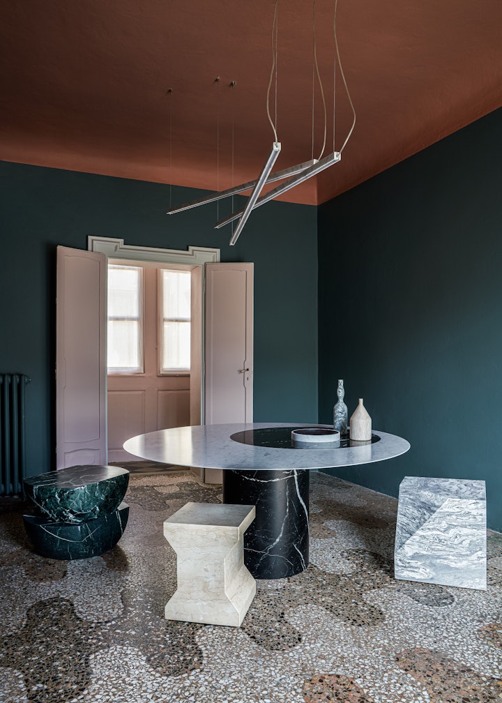
4 key aspects to think about when choosing wall colours
Natural stone is in our DNA, so understandably we are delighted to use it for every wall of a space, not just for its aesthetics, but also because it is hardwearing and long lasting, meaning it delivers on both design and practicality. However, for various reasons, such a solution is not always practical or even possible, but fortunately, the versatility of stone means that it combines beautifully with painted walls.
And, we never forget one of the guiding principles of interior design: all the various components of a space need to live harmoniously together.
It’s no secret that we are huge fans of the so-called “Total Look” in natural stone, so creating that balance is not too difficult, but with the right eye and by following a few guidelines, it can also be achieved when you mix your wall surfaces up.
There is also another rule when it comes to Interior Design 101 and that is that when you combine colours you have to take a number of different factors into consideration to obtain the result you have in mind or on your Pinterest board or scrapbook. And only once you’ve done this, can you start to truly understand the exact range of tones and textures that will work best in the room or space in question, and how to best combine them.
There are 4 primary aspects to think about:
- What already exists
- The dimensions of the space
- Light and/or lighting
- The hero elements of a room
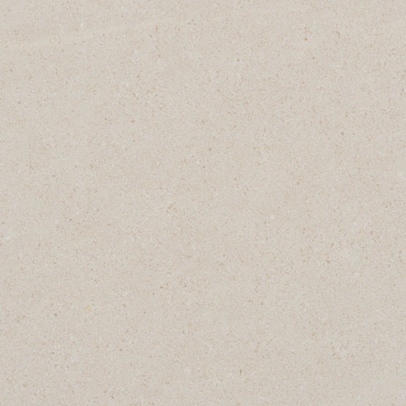
The first thing to consider is how busy the space is in terms of existing décor elements. For example, if the floor is particularly striking or special, it is going to be the focal point, so it’s best to avoid competing with it through bright colours or stark contrasts on different walls. In such a case, tonal variations can be very effective, for example one understated but elegant wall in honed Crema d’Orcia limestone would pair beautifully with a soft creamy paint on the others. On the other hand, if the floor or furnishings are relatively neutral, a bold colour on the walls will bring the entire room to life.
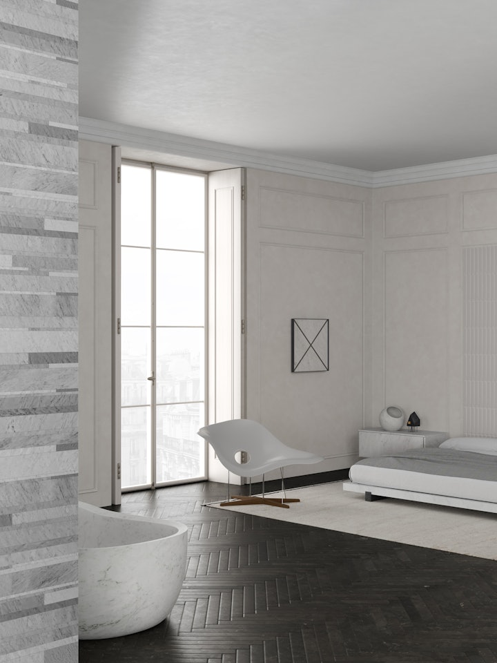
The Rule of Three
Whether the room is a completely blank canvas or has some existing features to factor into your choice of wall colour, the size and shape is crucial. Colour has almost magical properties in the way it can deceive our eyes and can be a great help when it comes to painting a small room, for example. In this case, whether you are after a soft contrast or something a little more dramatic, lighter colours will make the space seem larger. With larger rooms, on the other hand, you can add depth by playing with darker shades.
The same principles can be applied when thinking about how much light a room enjoys. If there is a lack of light, it’s best to avoid dark colours as they tend to absorb any light there is, whereas the world is your oyster in a space with plenty of natural light, and here you can play with the deeper hues on the paint chart to your heart’s content.
Last, but not least, you need to choose a hero. Is there a particular feature, be it the walls, floor, even a picture or item of furniture, that you want to place in the spotlight? Once you’ve decided that, then all other elements need to be chosen and positioned accordingly, to create a cohesive overall look.
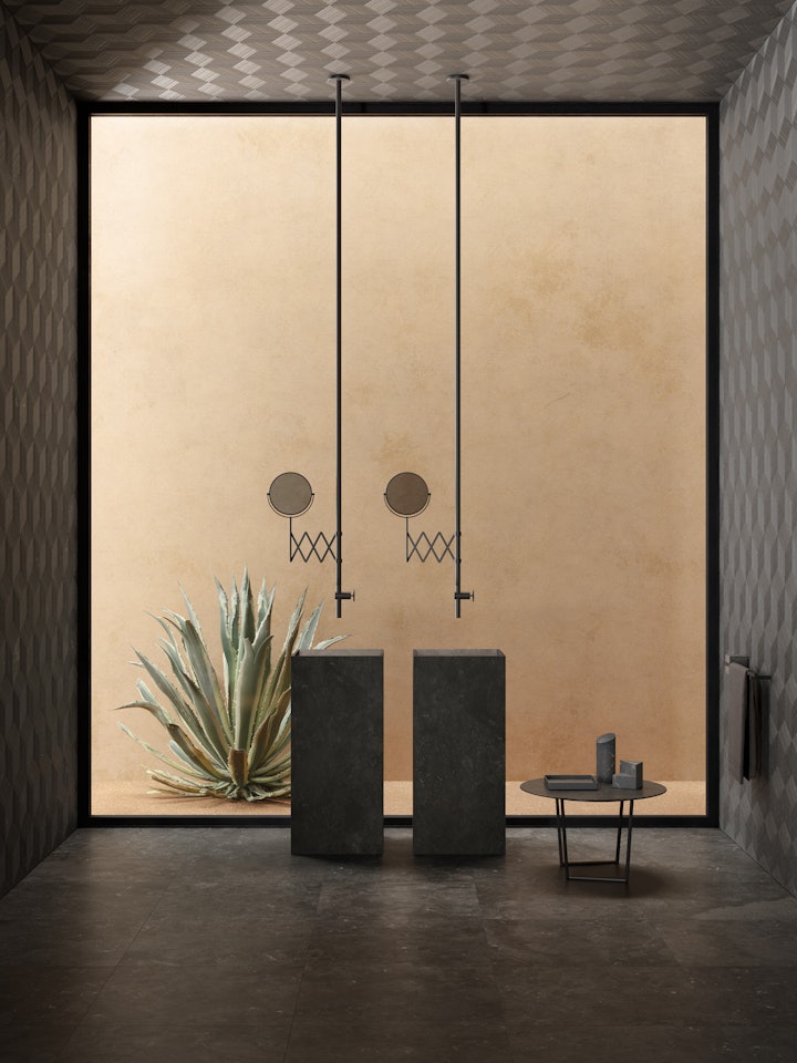
The Rule of Three
Interior designers have a set of almost-inviolable guidelines and one of the most famous is the Rule of Three, also known as the 60-30-10.
In essence, it means that design elements look better in groups of threes, whether talking about size, groupings of art or furniture and – importantly for us today – colour. The principle is based on the idea that to obtain a winning look, a maximum of three colours should coexist. It’s even broken down into precise percentages:
- 60% the dominant colour
- 30% secondary colour
- 10% accent colour
The dominant colour is invariably used on the floor, walls and curtains or shutters, and given its abundance, should be a neutral shade that brings together all the other elements in the room. The role of the secondary colour is to introduce depth and usually this will be a darker shade of the dominant colour’s palette. Then, the fun often comes with the final 10% that makes up in impact what it lacks in quantity. This is where you can choose a stark contrast or something unexpected, and this is generally created through accessories and décor details. However, the rule stops here, because you may decide to play your accent card by opting for something more “permanent” or impactful such as a coloured or feature wall.
The important thing is to not exaggerate and go over the top, as too many colours in a room can be overwhelming, busy and you may very well tire of it quickly.
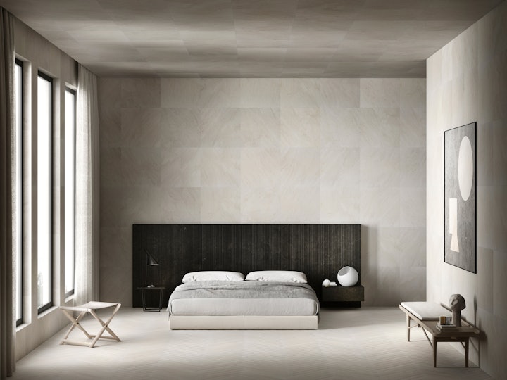
Bedroom colour schemes
When deciding on your wall colour or colours, it’s worth taking some time to get the science books out and enter into the world of colour psychology.
Every colour can affect our state of mind and evoke very different sensations which is why it’s important to think about the way we use the various rooms in our home and how the role their décor can play in our everyday life.
For the bedroom, for example, you want to create an atmosphere that is conducive to rest, so deep colours and soft contrast on the walls are called for. A Salvatori Total Look comes into its own here, with the neutral tones of our palette of natural stones ideal for creating this effect. And, if you want to differentiate the walls, a deep blue is a perfect counterpoint to the cool tones of this room, with the natural, relaxing feeling created by Bianco Carrara in Rain texture.
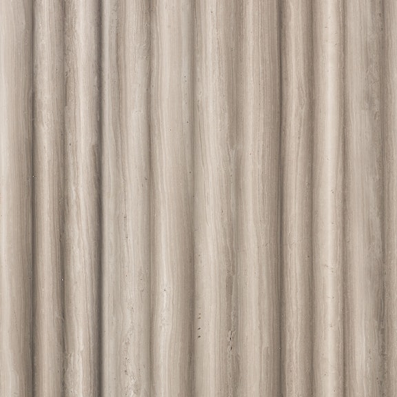
If you prefer warmer tones in your bedroom, why not opt for a delicate pale or powder pink combined with the creamy, elegant tones of Crema d’Orcia Select in Romboo texture for a feature wall that blends without overpowering the space or disrupting the sense of harmony.
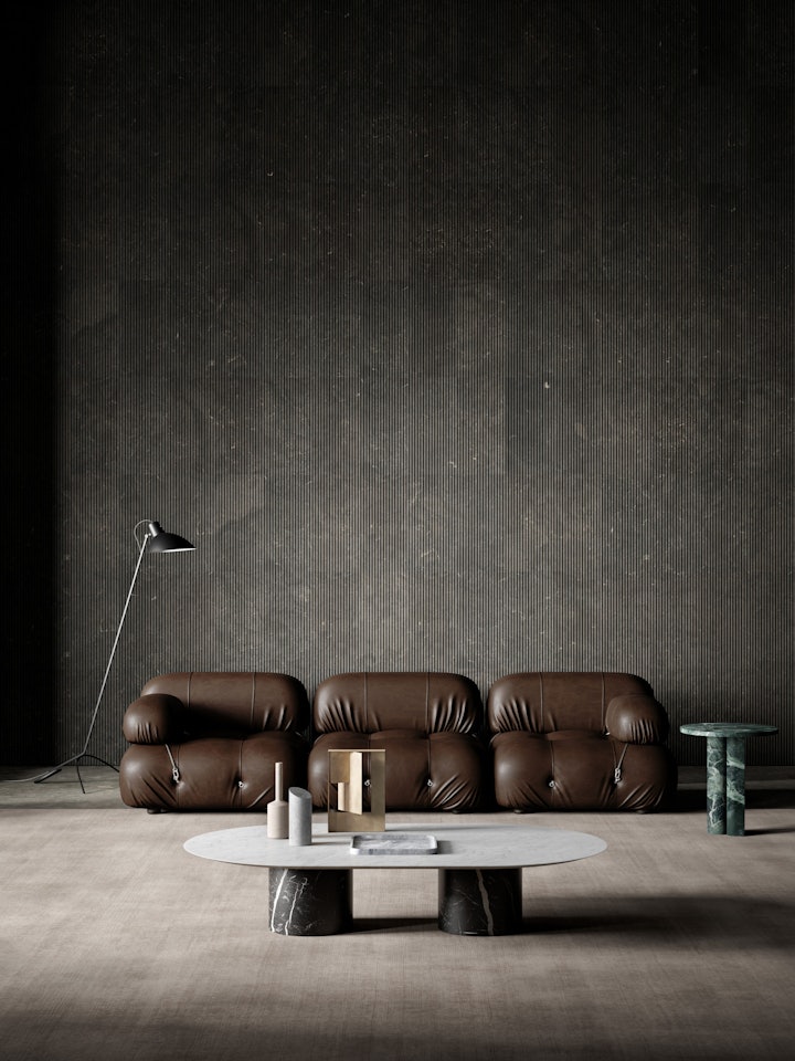
Living room colour ideas
A dynamic environment, the living room lends itself to more audacious colour combinations.
If you want to combine painted walls with natural stone, compared to the bedroom, you can play with more vivid, brighter colours such as teal blue, which definitely makes a statement, but at the same time, will create a cosy atmosphere on a rainy Sunday afternoon when you just want to lie on the sofa and watch a film. Currently a popular choice with younger clients, it teams up beautifully with grey, and here something like Gris du Marais® Lithoverde® would be a gorgeous combination.
Another interesting pairing at the other end of the colour spectrum, as long as the colour and style of your floor is compatible, is a lovely brick red, offset by the traditional pale honey tones of Light Travertine in a simple honed finish.
Or, if you love the idea of natural stone on all walls, but still want some kind of contrast, simply opt for a combination of light and dark, and even mix up the textures, with a solution such as Silk Georgette® in Stone Tatami and honed Pietra d’Avola. This pairing of greige and rich chocolatey brown is a failsafe way to create a living room that is welcoming, stylish and decidedly not bland.
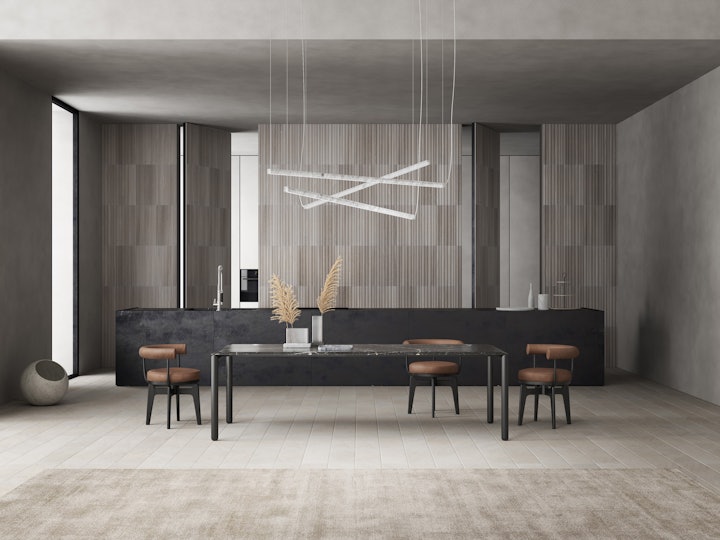
Kitchen colour combinations
Deciding upon colours for the walls of a kitchen presents some particular – let’s not say challenges – aspects to consider. While it is another dynamic environment, it also has to accommodate certain elements where you have limited opportunity to play with look and style, such as appliances. This means that the Rule of Three comes into force again, to ensure you avoid a cluttered, busy look with a mish-mash of colours.
If your cabinetry is already multi-coloured, but you want to avoid homogenous walls, the best option is to temper the contrast with a combination of natural stone and a paint in the same tonal family as the cupboards.
For more monochromatic or plainer kitchens where a splash of something extra is needed to lift the entire décor, you can experiment and try out some brighter colours on the walls. For example, a deep mustard yellow would be stunning paired with a grey stone, such as Grigio Versilia, with its glorious swathes of veining.
In paler kitchens, a deep Bordeaux would create a striking counterpoint to a warm, light stone, such as Silk Georgette with its delicate waves of patterning.
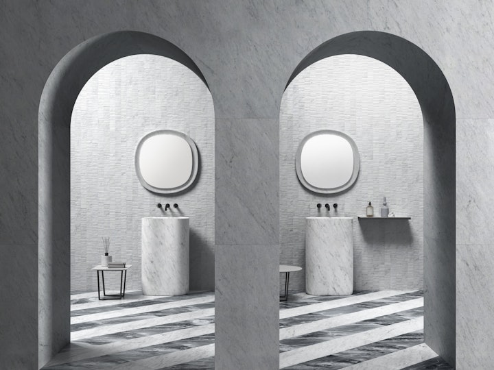
Bathroom wall colours
Like the bedroom, the bathroom is a kind of haven, and as such, you want to create a sense of relaxation and tranquillity and the best way to achieve this is by choosing colours and textures for the wall that evoke nature.
There is no material better suited to achieving this than natural stone, with its wonderful veins, nuances of colour and tactile properties.
Its inherent spirituality creates atmosphere all on its own and in a bathroom, it really doesn’t need other colours. However, that said, if practical aspects mean that you need to paint one or more walls, opt for a colour similar to the stone to preserve the sanctuary-like feeling. A perfect compromise would be to choose a texture to create interest, such as Chevron in Bianco Carrara, and then to simply paint the other wall or walls in classic white for an understated but stunning bathroom.
Another way to create contrast but stay with the idea of nature is to opt for colours that recall water and the sky. We’re not talking about glorious blue Tuscan summers here, but moody, atmospheric grey, and a combination of stones such as Gris du Marais and classic white Bianco Carrara fit the bill perfectly.
So, with the above tips in mind, let’s now take a look at some examples of gorgeous modern rooms where combining different colours or materials can create feature walls that take the entire space to another level of design and impact.
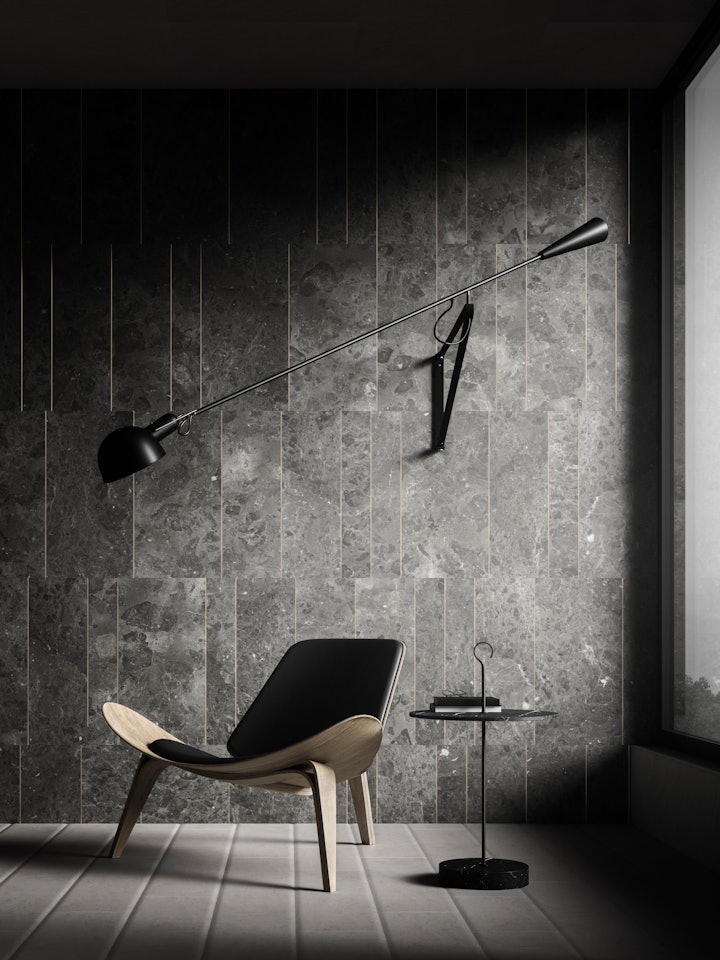
Colour contrast Scandinavian style
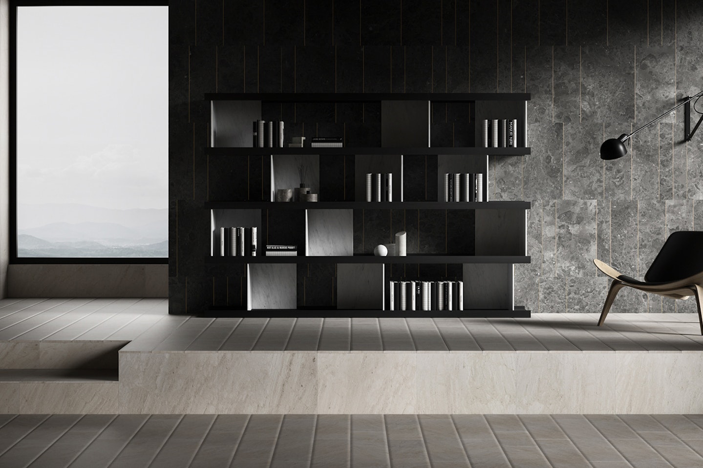
In this Salvatori “Total Look” space with its combination of light, neutral colours and pared-back furnishings, the feature wall not only provides a point of interest, but also focuses attention on the reading nook.
The pale floor and lefthand wall, both in Crema d’Orcia limestone, contrast perfectly with the rear wall in Gris du Marais® Tratti motif where anodised gold inserts add a touch of understated bling for an overall effect of harmonious elegance and understated luxury.
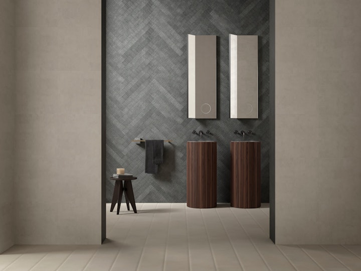
Contrasting basins
Combining different wall styles doesn’t have to be limited only to a single enclosed room, but can also work on a grander scale, as in this photo where the tonal combinations go beyond the bathroom and into the hallway, with tone on tone and the happy harmony of materials creating a fluid, cohesive feeling.
The hallway wall matches the floor in Stone Parquet Crema d’Orcia and flows through into the bathroom zone where the eye is naturally drawn to the wall in Pietra d’Avola, with the Adda freestanding basins clad in ribbed walnut firmly in the spotlight. The overall effect, with the combination of two types of natural stone and warm brown wood, is one of tranquillity and wellbeing.
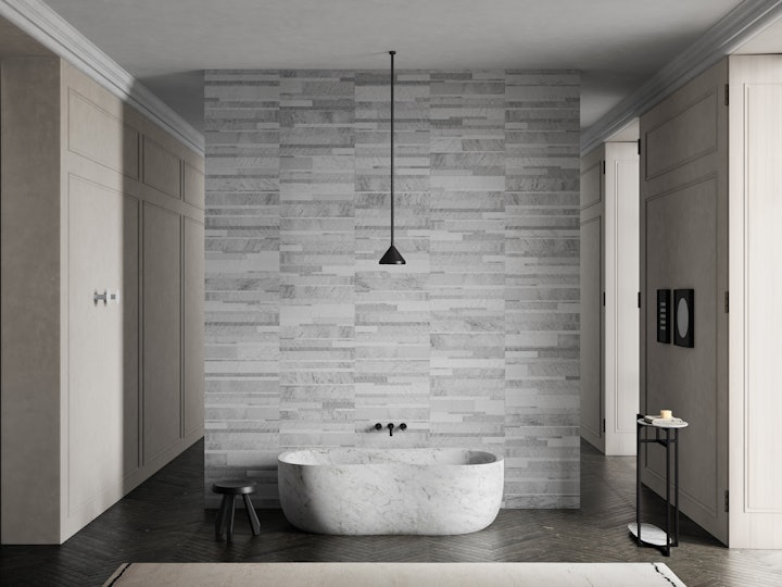
An open space bathroom for understated elegance
A bathroom in a bedroom, especially an open space version, is not a commonplace feature, but it epitomises a modern architectural approach in which conventional barriers and distinctions are removed. To achieve a result that is not only cohesive and beautiful, but also functional, there is no better material than natural stone. While a Total Look would be the ideal solution, this may not always be possible, but the good news is that stone lends itself perfectly to being mixed and matched.
The fusion of two very different environments calls for an expert eye when it comes to design, if you want a result such as in this photo, where the delicate blends of white of the Bianco Carrara Lithoverde® wall work beautifully with the dark brown stone floor to simultaneously unite and delineate the bath zone. The spotlight then falls on the star of this area, the Anima bathtub, creating a sense of theatre without losing the sensation of wellbeing that a bathroom should transmit.
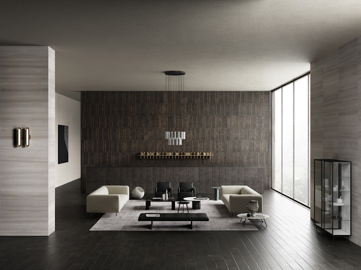
Bold contrasts in a vast space
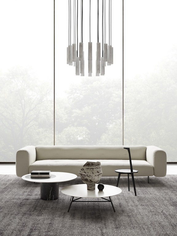
As we’ve said before, the living room is the perfect place to experiment and play with bold contrasts and this example showcases the versatility of stone in creating striking contrasts in a large space.
The same juxtaposition of dark and pale that we see on the walls is echoed in the furnishings where the 26 cylinders of Bianco Carrara marble in the Silo chandelier are afforded centre stage by the backdrop of a feature wall in Pietra d’Avola Tratti and the counter in Rain texture. The contrast is decidedly strong, creating depth and an inviting, elegant environment.
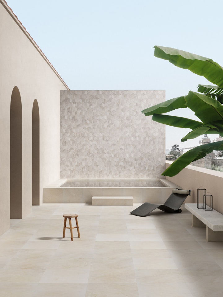
Al fresco design excellence
Up till now, we’ve been talking about feature walls inside the home, but we’re going to end with a look at how the guidelines apply outside. The problem of natural light will usually be a lot easier to deal with here, but you still need to consider the usual factors we’ve covered in this article.
Natural stone, with its hardwearing properties, is ideal for outdoor spaces and requires little or nothing in the way of embellishment or added extras.
If you want to combine different types of stone, the best option is usually to go for tone on tone such as in this photo where the warmth of the beige side walls harmonises perfectly with the Crema d’Orcia paving, finished with an original choice in Silk Georgette® Romboo texture. It not only makes an arresting backdrop to the spa pool, but also brings together the entire terrace, creating a restful al fresco living space.
We’ve come to the end of our exploration of wall colours, and hope that you’ve found it informative, interesting and inspiring!
Whether you are looking to mix up your wall colours or to create a feature wall that anchors a space, there are a number of factors to consider to ensure you achieve that stylish look you have in mind. And remember, the key is to ensure there is a sense of cohesion so that all elements come together. Easier said than done, which is why it’s always a good idea to talk to an expert and understand how to bring your idea to life.
We’re always here to help, so why not browse through our stones and textures, which are perfect for creating stunning walls, then speak to one of our design consultants. We’d love to be part of your design project!
