5 tips for a stylish and convivial open plan kitchen and dining room
03.2022
Open plan living has never been so popular, so we’ve created a simple guide to help you design a stylish kitchen-dining layout
The 5 steps to create the perfect open plan kitchen and dining space
It is enough to merely think about the proliferation in cookery shows over the past few years to understand the incredible rise in all things gastronomic that is sweeping the world. This phenomenon has also seen the kitchen take on an even more central role, becoming not only larger, but often also being part of an open plan layout that incorporates a dining area.
A sociable and practical arrangement, it is ideal for busy households, allowing you to multi-task with ease. While you prepare meals or tidy away, you can chat with visitors and other family members or keep an eye on children as they play or do their homework. And of course, with so much space at your disposal, it makes entertaining that much easier, both in terms of preparation and interacting with your guests.
To create an open plan kitchen-dining layout that is both functional and stylish, there are 5 simple guidelines, so let’s take a look at them.
Decide upon a layout
A smart way to optimise space, an open plan kitchen-dining area set up is particularly useful in smaller homes, while in larger residences, it is a great way to create a convivial, versatile zone.
The first thing to do, unsurprisingly, is think about just how many square metres you have at your disposal and how you can work with them to create two visually distinct and user-friendly areas, in keeping with one of the main principles of open plan layouts.
As a general rule of thumb, the kitchen should be located along the wall furthest from the main door, to avoid the chaos and comings and goings that the entrance inevitably must accommodate.
If space is at a premium, you should ideally position both the dining and kitchen area in parallel with each other to provide a greater sense of fluidity. The alternative solution would be to locate both zones along the length of the entire room, thus optimising space.
If you are working with a square layout, you could divide it into two more or less equal areas and separate them with a partial wall or, even better, as it gives you an additional workspace or eating surface, an island or peninsula.

Select the right material for your walls and floor
When it comes to thinking about the walls and floors of an open plan kitchen-dining area, you need to look for solutions that are not only practical and hardwearing, but that work in harmony across both zones.
Inevitably, worktops and floors are going to be subjected to spills from food, liquids and oils and, quite possibly, bear the brunt of the occasional utensil or pan being dropped. This means that whatever material you choose should be resistant, non-absorbent and easy to clean. At the same time, however, it should be elegant, particularly in the dining area where you want to create a more stylish atmosphere.
Natural stone is a perfect solution for a combined kitchen-dining layout as it is extremely tough, able to withstand objects being dropped on it, chairs being scraped and food and liquid spillages. It also delivers on aesthetics and is extremely versatile with a host of different colours and patterns to choose from. And, if you want something that goes beyond the standard honed or polished tiles available, we have spent decades experimenting with stone to create innovative textures that add the wow factor to any room.
One such example is Stone Parquet, our interpretation of traditional wooden flooring, a material that is undeniably beautiful but can be a little hard to look after in high-traffic spaces that are subject to more wear and tear than, for example a bedroom. With our stone version, however, you enjoy the aesthetics of wood parquet and the hardwearing, enduring qualities of natural stone.
Choose your colours with care
The next thing to think about is your colour scheme and when it comes to an open plan kitchen-dining combination, you should stick to a maximum of three shades, otherwise you risk creating visual chaos. To foster conviviality and a welcoming atmosphere, pale or neutral colours are best.
Once you have decided upon your palette of three colours, you can then play with them across the various components that make up the space, namely walls, floor, cabinetry, benchtops and furniture.
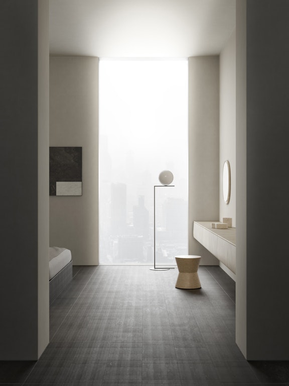
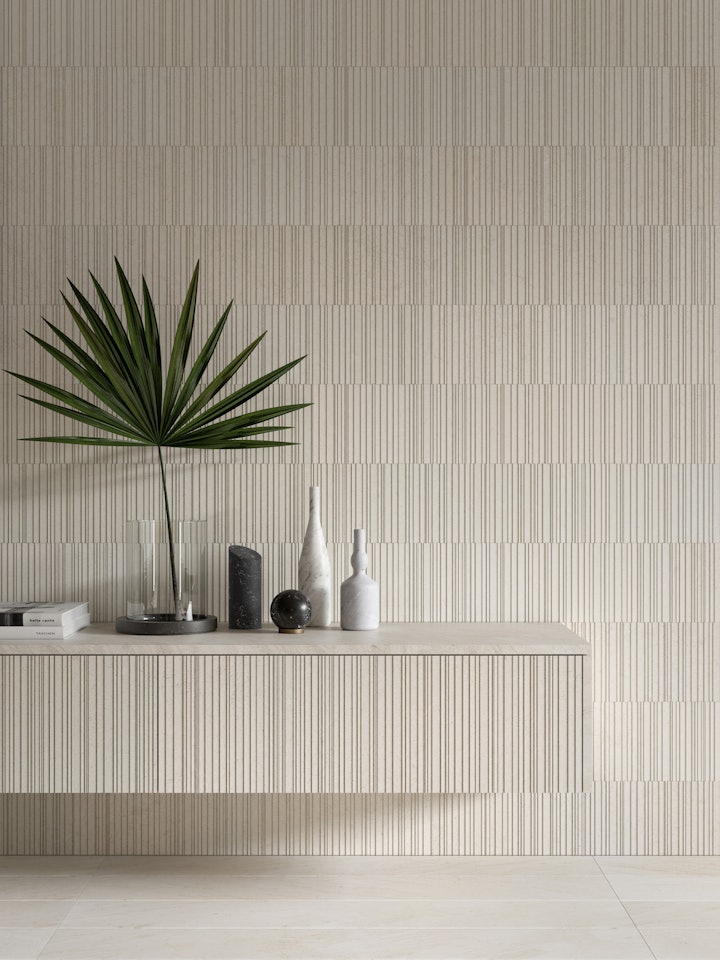
Our Crema d’Orcia is the perfect example of a neutral colour for a modern open space that works not only for larger elements such as the walls and floor, but also for smaller objects. Pale and creamy, it adds warmth and elegance to both the kitchen and dining zones and can be complemented with splashes of other colours.
On this note, if you do want to inject brighter accents, keep the “less is more” maxim in mind and just introduce a handful of elements so that you avoid them becoming too dominating.
Divide and conquer
As we mentioned earlier, an important aspect of an open plan layout is that the different zones are conceptually separate and visually distinct.
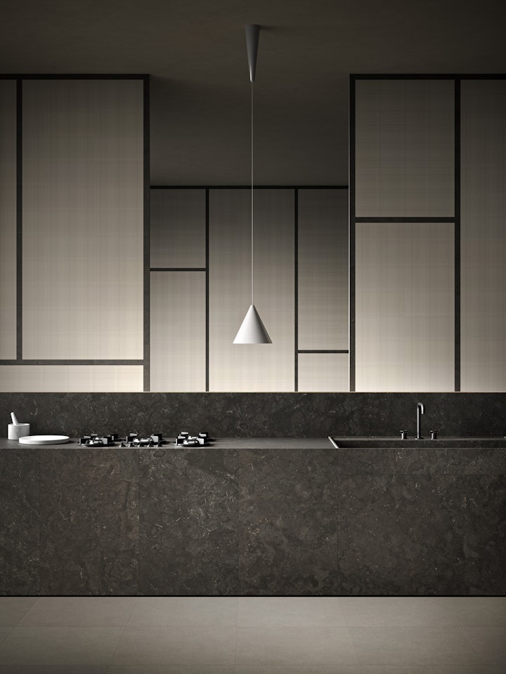
An island between the kitchen and dining area is a popular solution, particularly where you have plenty of room, because it creates additional bench space, meaning you don’t have to have your back turned to guests or other family members while you work. It also provides valuable, easily accessible storage space underneath for items such as glassware, crockery and recipe books.
A stone worktop on a kitchen island is an extremely elegant and functional choice, especially if you like to make your own bread or pastry, as its coolness provides an excellent surface for kneading and rolling dough. Our range of natural stones covers a palette of timeless colours from the classic white of Bianco Carrara to creams, greys and rich dark browns, and we can provide worktops cut to the size you want for your kitchen.
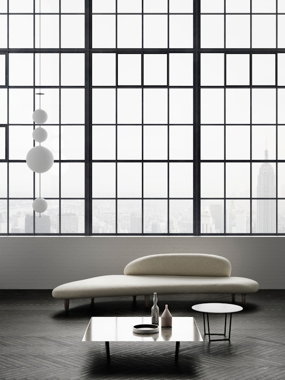
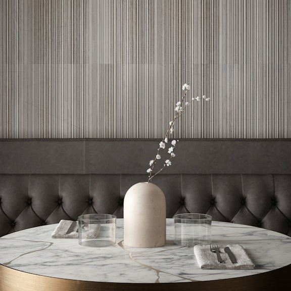
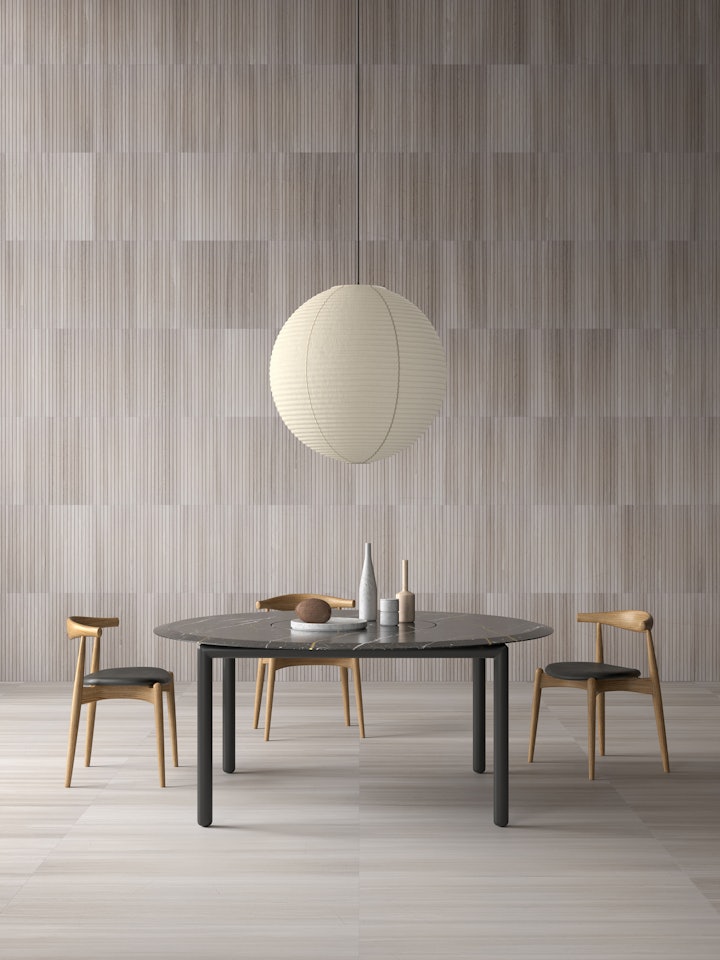
An alternative to an island is a table to create some type of delineation, and in this case, you want to opt for a distinctive piece that catches the eye and is large enough to clearly serve as a visual partition, signalling that the kitchen stops here. Our Design for Soul dining table ticks both boxes and then all you need to do is add understated designer chairs and a striking pendant lamp above and you have a clearly defined, stylish dining zone.
Add designer finishing touches
Once you have the main kitchen and dining pieces in place, the fun starts with the smaller elements, and these are important in bringing the total look of your open plan layout.
While we have urged you to veer towards just a handful of colours and neutral tones for main items, when it comes to shelving, wall decorations and accessories, this is where you can have fun and really inject your personality and stamp your mark.
Given that the greater (if not entire) part of your table will be unused for the majority of the time, instead of leaving it bare, why not place one or two decorative objects, vases or trays on it?
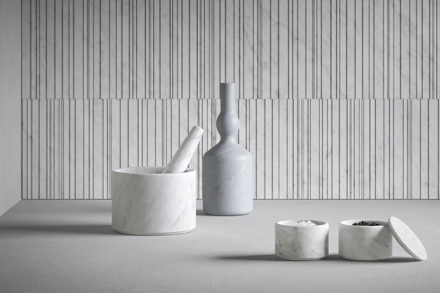
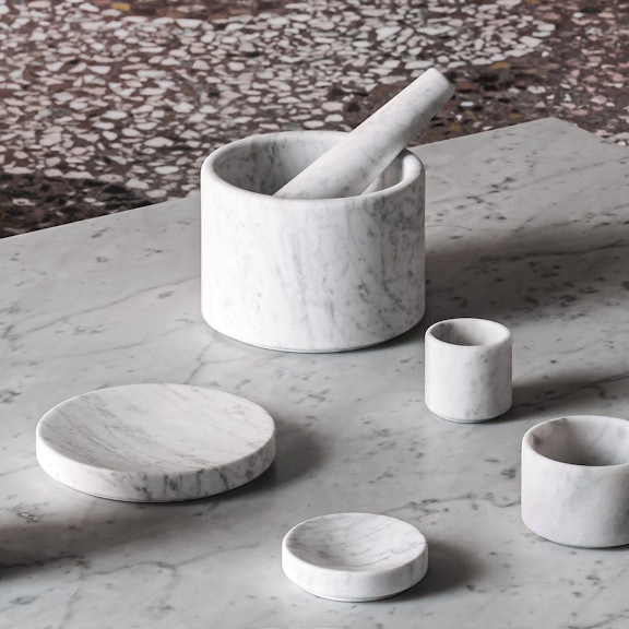
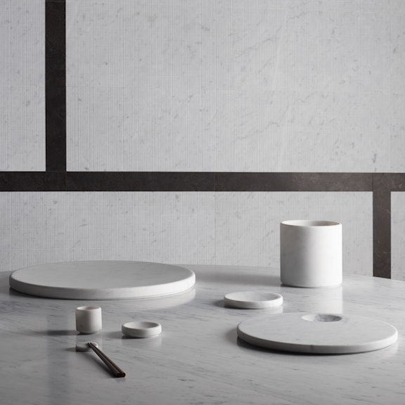
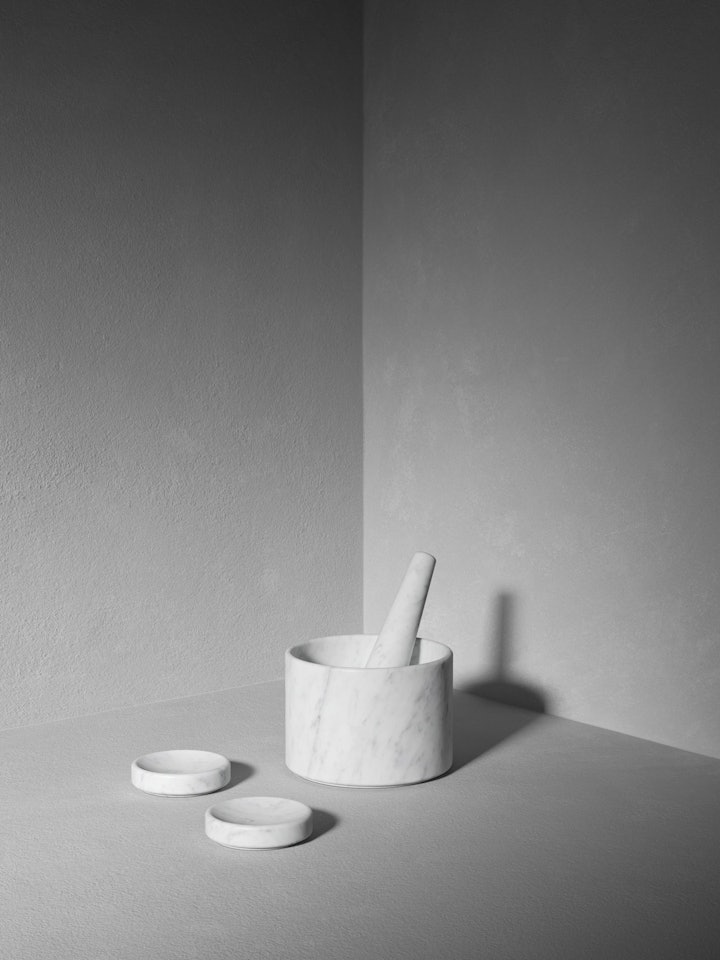
When it comes to the kitchen, there is plenty of scope for adding pieces that are not only functional but also lovely to look at, such as items by renowned designers from our kitchenware range. While a bench top is, first and foremost, a practical space that should be uncluttered, this doesn’t mean it should be completely empty or sterile, and white marble accessories such as an Ellipse salt and pepper set, pestle and mortar or wine cooler are the perfect way to add Made in Italy design to your kitchen.
