How to choose the perfect colours to match natural stone décor
03.2022
Learning how to choose the most suitable furniture colors for natural stone will help you understand its most creative applications and creare the most enviable looks.
How to choose the best colour combinations for natural stone décor
Today we’re entering into the wonderful world of colour which is full of fun but can also present challenges, especially when it comes to deciding on which colours work best together. And, when we’re talking about natural stone, the choices can be even more bewildering, which is why many people simply turn to a professional. However, there’s no reason why you shouldn’t have the fun of selecting your interior colour combinations yourself, especially as the proliferation of colour charts and Pantone swatches makes it a breeze to compare shades side by side.
Then, all you need are a few guidelines, which we’ve put together for you with five colour schemes that we hope will inspire you if you’re planning to decorate your entire home, or even just one room.
Colours that work well together
Those with an interest in fashion and design know that not all colours go together, and the same philosophy applies to interior design, but perhaps it’s even more important here, as mistakes are a little more difficult to rectify! However, when used well, the right colour combination in your home, complemented by accessories and furnishings, can completely transform a mere four walls into a welcoming, comfortable space.
This is also where a colour wheel can prove an invaluable ally as you can look at the different colour groups and see how they work together, browsing among primary (red, blue and yellow) and secondary hues (green, orange and violet). It’s a clear and easy-to-understand tool that is a must when you’re thinking about colour combinations.
Current colour trends
Like the seasons, colours come and go in interior design trends, so we’ve selected a handful of those that are currently in vogue:
- Blue
- Grey
- Red
- Green
- Dark brown wood
Of course, this doesn’t mean your colour scheme has to be limited to these, because each of them can be combined with others not on this list, but to simplify things, we’ll take a look at an example of each of these five colours, showing how they can set off a floor or wall in natural stone to absolute perfection.
So, with that said, let’s take a look at five inspiring interior design colour combinations!
Colours that work well with blue
As we saw above, blue, together with red and yellow, is a primary colour. That means that not one of these three can be obtained by mixing others, but instead, this hardworking and powerful trio form the base from which every other colour is created.
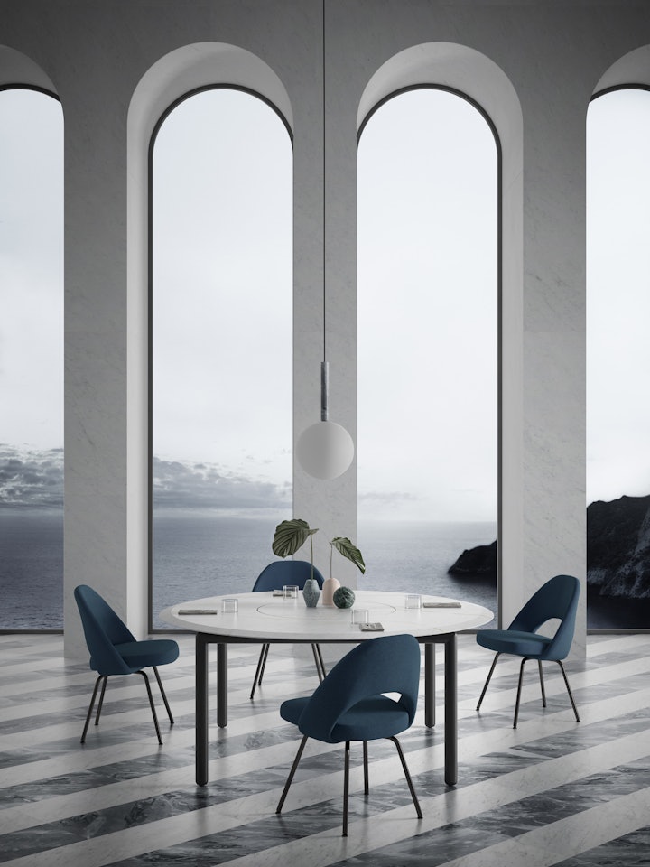
Looking at what works well with blue, there is of course that failsafe option of white, but don’t be afraid to use green and pink, particularly in one of the latter’s creamier tones. The good news is that you don’t always have to choose just one, as long as you keep it to small touches, as in this photo where all three colours are present. The canvas of stone is created by the floor in Bianco Carrara white and Grigio Versilia grey with the walls and Design for Soul dining table also in white, and then you have your splashes of colour, with the blue of the chairs dominating, and beautifully complemented with Mono vases in Verde Alpi, Rosa Perlino and Cipollino.
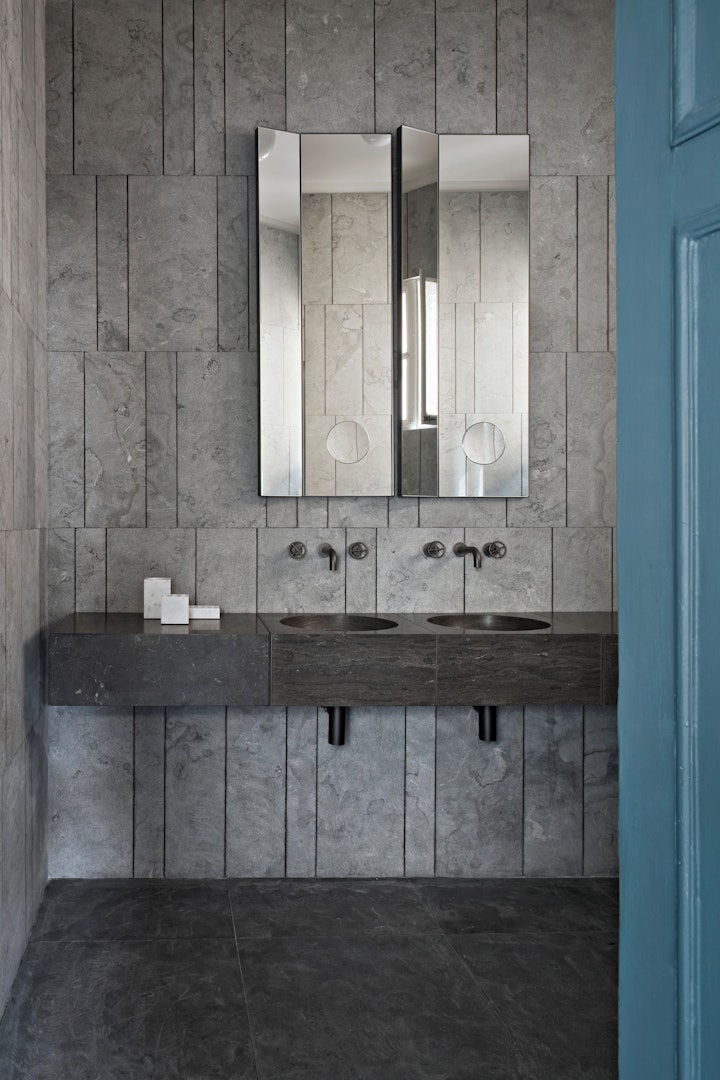
Colours that combine well with grey
Grey is a secondary colour that comes from a very simple recipe of black and white. It works particularly well with pastels such as cream, coral and baby or powder blue. This photo is the perfect example of how a predominantly grey décor is lifted from what could be drab and dull to an elegant and stylish space, courtesy of the splash of powder blue given by the door. As an aside for those who are fascinated in colour, you may be surprised to know that the grey Tratti Cotone walls here are actually in Pietra d’Avola, the dark brown limestone seen on the floor, Alfeo basins and Ciane drawers, but working with it in a certain way completely changes its effect. The magic of colour, indeed!
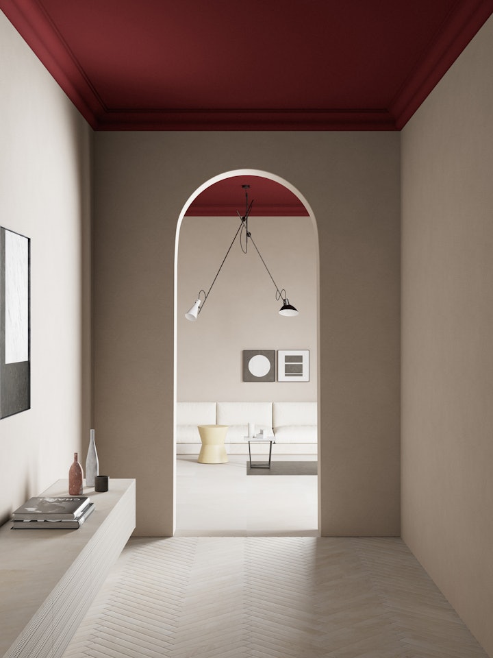
Colours that work with red
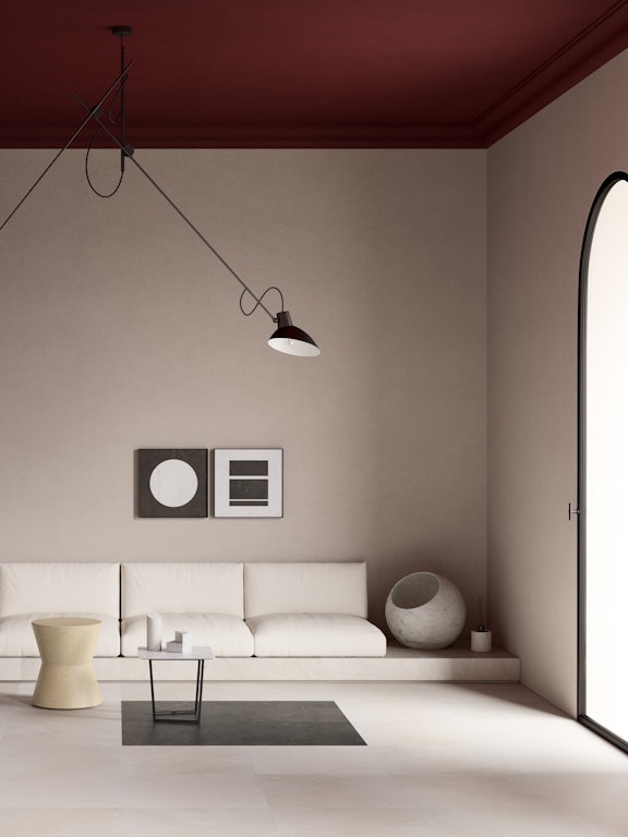
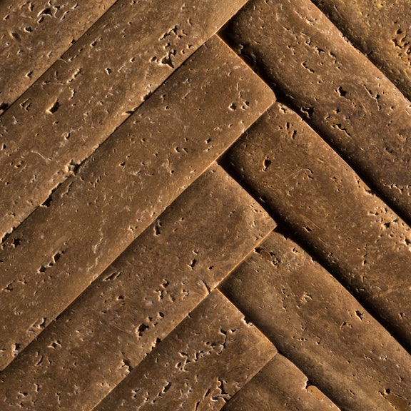
Let’s go back to another of our primary colours, with a look at how red can be used with stone. While posing a few more challenges than its blue companion, it can really add a touch of drama to more subdued colour schemes. Most commonly it is combined with black, green and white, but those wanting to be a little more daring will be rewarded. For example, here we have pale creamy Crema d’Orcia limestone as our main décor element, with floors in Stone Parquet and Balnea drawers with Bamboo front facings. Undeniably elegant, it is elevated to another level by the bold use of red on the ceilings.
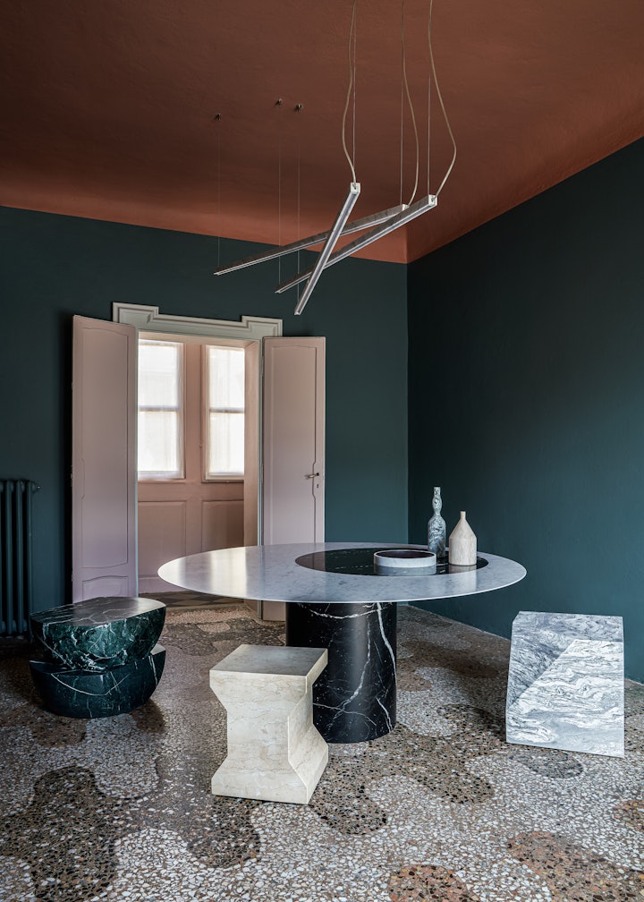
Colours that work with green
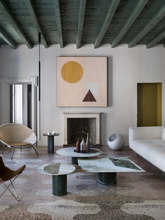
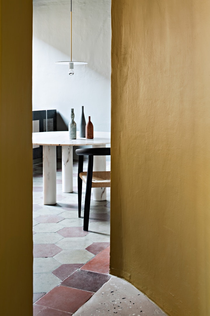
Created by mixing blue and yellow, green comes in a myriad of shades and tones and is a friendly colour, in that it enjoys the company of many others. As always, there are the trusty black and white, but you can also confidently combine different shades of green together, or opt for pastel or subdued colours such as beige, grey or cream. This photo is a great example of how colour can be used daringly, with the original centuries-old Terrazzo floor and Proiezioni table in Bianco Carrara and Nero Marquinia set off strikingly by an unconventional combination of green and pale pink. Here, the interior designer has had great fun, adding additional colour accents with Ikona stools in Giallo Egiziano, Rosa Perlino and Verde Guatemala.
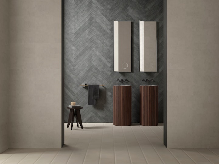
Colours that work with dark wood
We’ve possibly slightly cheated here, choosing a material instead of a colour, but dark wooden browns, such as chestnut, walnut and mahogany, work perfectly with natural stone, creating warm, inviting interiors. But, just because the two are often combined, that doesn’t mean it’s easy to create an innovative and stylish result. For that, you need to add a dash of creativity.
From our experience in working with natural stone for seven decades, we have a few favourite colour combinations when it comes to interior design schemes in a mix of stone and wood. As always, black is a safe choice that brings contrast and impact, but, at the other end of the colour spectrum, we would suggest going for cream. It tends to soften an environment and bring all the elements together in a harmonious fashion, such as in this bathroom where the floor and front walls in Crema d’Orcia create a lovely pale foundation, to which is added a grey wall and a pair of freestanding Adda basins in ribbed walnut.
So, should you choose warm or cool tones?
As we’ve seen, natural stone is wonderfully versatile and can work with many different colours, from classic, subdued shades to more vibrant daring blues and reds. When it comes to interior design, choosing your colour combinations doesn’t have to be difficult, and the results can be extraordinary. The final question to answer is whether it is preferable to opt for warm or cool tones, but if you read the examples of colour schemes suggested above, you will understand that the answer to that question is that there is not definitive answer! Colder colours, if they are combined wisely, can create environments that are as warm and welcoming as those using warmer tones. It really does come down to personal taste.
So, all that’s left to do now is browse through our textures for more inspiration, or contact our team of in-house interior designers who will help develop your perfect colour scheme!
