A conversation with illustrator Federico Babina
03.2022
"I’m fascinated by the idea of being able to blend the world of architecture and illustration"
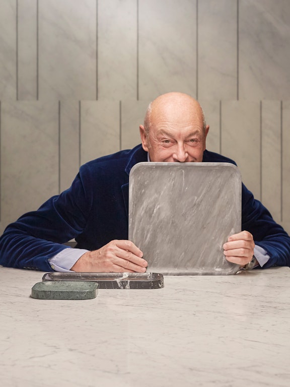
Illustrator Federico Babina knows a thing or two about design. Trained as an architect and graphic designer, he has been conjuring up brilliant hand-drawn worlds — often inspired by architecture and design — since 1994.
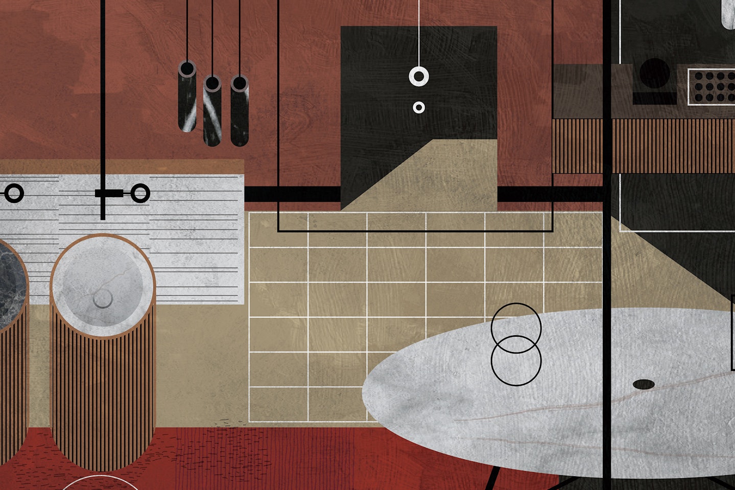
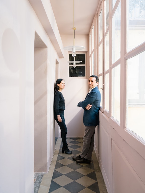
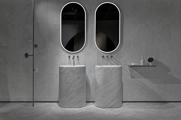
We were originally tipped off to Babina’s work by Piero Lissoni – who created the visual identity for the catalogue and invites — the Italian-born, Barcelona-based artist was the ideal person to visually interpret Elisa Ossino’s Hidden Rooms concept in the lead up to its big unveiling during Salone del Mobile. Babina was able to perfectly translate the beauty of natural stone: creating the visual storytelling to accompany the exhibition by blending the perfect forms of John Pawson’s new Ellipse Collection, Lissoni’s exquisite René tables from the Lost Stones Collection and the optical artistry of Ossino’s installation into a series of richly layered illustrations that teased the grand reveal.
We spoke to Babina to talk about his no-rules design, inspiration for the illustrations and the raw materials that were the basis for the elaborate drawings.
Can you tell us a little about yourself?
I am an Italian architect and graphic designer that lives and works in Barcelona, but mostly I’m a curious person (since always). I am both an architect and a graphic designer, and I work in both “areas”. I especially enjoy when the two disciplines meet and intersect. For example, an architect has to explain his projects through illustration and drawing. Design is the first way to give shape and body to a project. In this sense, every architect should be a graphic designer. I’m fascinated by the idea of being able to blend the world of architecture and illustration. Transform the architecture into an illustration and illustrations into an architecture.
How would you describe your style of illustration?
In general, I do not want to have a style. Having a defined style means that you have to follow rules and regulations.
I prefer to try to have a free language without too many limits that restrict the expressiveness.
I like trying to explain the world I see through different techniques of expression. I’m always looking for new forms of language to describe the world around us. I like the richness of the language and the diversity of its forms.
I do not want to confine myself in a prison of a style or shape. The only rule I try to follow is to have no rules, develop a thought and then turn it over and look at it the opposite way.
I see my illustrations as a different way to describe the richness of architectural expression and especially the contacts with other disciplines. Search and find the architecture in different places. The first step and the most important thing is to choose what I want to tell through my work. Once I’ve found the generating element the next stage is a research job to find the best way to describe and explain the concept. Transform the idea in an illustration.
I find it extremely interesting to combine different fields in one image and find a common language in different disciplines. There are endless connections and links between different art forms. My exercise is trying to discover some. Furthermore, I try to keep my expressive language as simple as I can. Simplify is the hardest thing.
To simplify you have to remove things in excess, and to do so you need to know what to remove.
Can you describe the collaboration with Salvatori?
The idea was to create a portrait of the object and its creator in a single image. Try to synthesise form and language through a unique illustration.
Where did you find inspiration for the illustrations?
I do not believe in the inspiration. The ideas are there waiting for us, the problem is that often we are not able to see them. I try to observe things from a different point of view. Looking at the world upside down can offer many creative ideas and awaken from a kind of “sleep of vision”.
Can you explain a little bit of each of the illustrations? What are the different elements within each image?
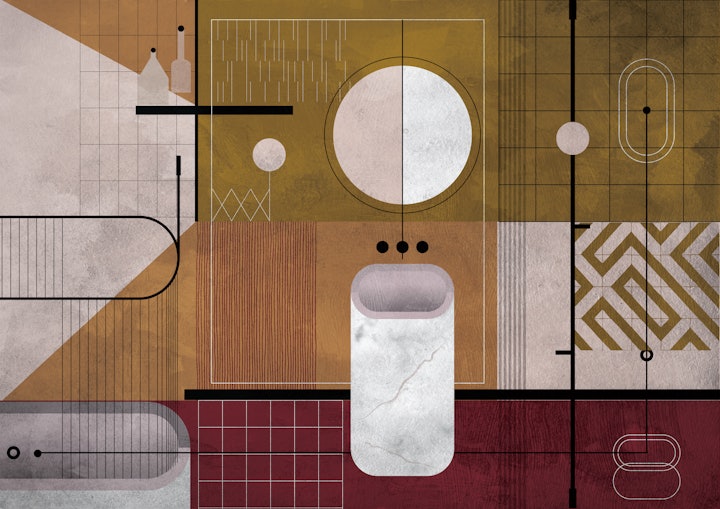
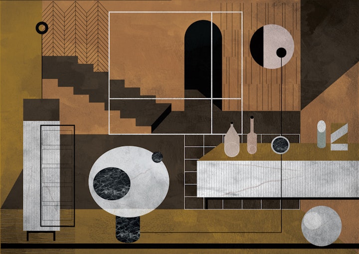
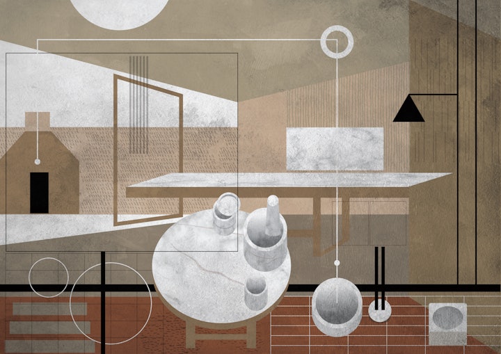
The idea behind the concept is to find a form of representation balanced between the abstract and the figurative. Illustrations capable of representing objects and the universe of designers through an exercise to un-inhibit the senses with the use of geometry and colours. A series of interlocking geometric shapes, materials and colours around a central matrix — The Design for Salvatori. A set of forms that represent the formal alphabet of different architects.
A series of “metaphysical” rooms that are transformed into paintings where you can read references to the design of objects or simply let your mind get lost between the lines and colours for more imaginative readings.
Through these compositions, I propose an ideal connection between design, as a form of representation, and the representation used in its design. Disordered rigour or a realistic fantasy are oxymorons present in these compositions.
What about the natural stone and Salvatori products inspired you?
Salvatori’s materials are the centre of its production, they are the generating element of shapes and uses.
Natural stones are the raw material on which to sculpt forms.
They don’t draw a shape and then they choose a material, but they sculpt the material to extract a shape.
How did you interpret Elisa Ossino’s design for Hidden Rooms into an illustration?
I wanted to create a space poised between the metaphysical and the realistic, capable of hosting Elisa’s aesthetic universe. Passing through my filter her delicate and poetic imaginary made up of solid geometries weightlessly.
