Banca REYL Intesa Sanpaolo, Geneva

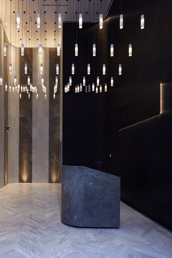
When REYL Intesa Sanpaolo Bank relocated to a completely renovated heritage building in Geneva, we worked with interior designer Coraline Fringhian on the décor of the atrium, a space with oversized dimensions that presented a fascinating challenge. Long, narrow and 8 metres high, it was an interesting opportunity to create an unconventional, spectacular yet welcoming entrance. Find out more about the project through the words of the designer herself.
Can you tell us in your own words a little about the project. What was the inspiration behind the design?
The brief was to transform a heritage building dating back to the early 20th century into the new headquarters of a private bank.
By choosing this iconic building in the heart of the city, just above the Passage des Lions on one of the most prestigious streets in Geneva, the city that is synonymous with the private banking world, the bank aimed to offer a convenient location for clients and provide a comfortable environment for staff.
The mandate given by the client was to create an authentic and welcoming setting with refined elegance and a majestic, yet human-centred feel, highly conducive to personal reflection and concentration.
A unique but unostentatious concept, a quiet luxury…
Quiet but… not so quiet!
The oversized dimensions of the entrance hall presented a real challenge. Long and narrow, with a height of almost 8 metres, it nevertheless provided the perfect opportunity to create an extraordinary, spectacular, and welcoming entrance.
Given the particularly high and narrow dimensions of the entrance hall, we aimed to create a play of curves and verticality.
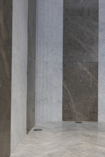
The rounded corners of the walls foster a more enveloping, cocoon-like feeling in this tall and narrow space. These curves are echoed in the design of the desk, which is asymmetrically shaped to shield the concierge from street views.
Vertical elements emphasise the impressive volume and height of the space, with the Bamboo texture further enhancing this effect. The interplay of colours adds even more depth. The hundred Silo lamps are arranged to fill the ceiling partially, providing a sense of transparency and volume.
What particularly appealed about the Salvatori products you chose?
Choosing Salvatori was an obvious decision, as the bank shares similar foundational values: a respect for expertise and deep-rooted traditions, along with a passion for innovation and ingenuity.
Salvatori combines old-fashioned craftsmanship with contemporary design and that balance between traditionalism and modernism is what truly appealed to me. I love this ingenuity. The techniques and materials used are applied confidently and boldly, challenging traditional norms.
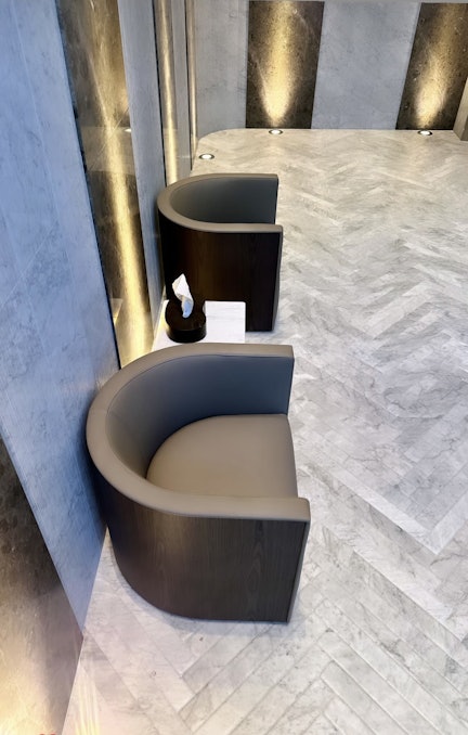
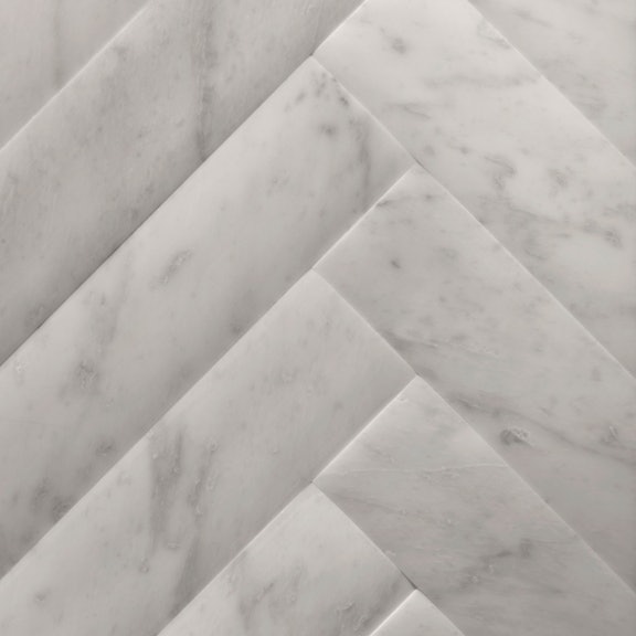
For example, the use of Stone Parquet in the entrance hall reinterprets the classic wooden flooring traditionally found in historic noble buildings, but in stone.
Or the hundred Silo lamps hanging from the ceiling resemble raindrops, creating a wave-like effect. When lit, they reveal the fine, translucent quality of the marble.
Being innovative with a material as special as natural stone allowed us to achieve the timeless elegance the client desired.
How did you find the experience of working with Salvatori?
I would recommend working with Salvatori to anyone! I am particularly grateful for how they embraced my design vision of the project. They allowed my personal creativity to flourish while guiding me with utmost professionalism and the magical Salvatori touch.
The collaboration was highly beneficial and enriching for all parties involved. It was a true team effort, united by a common goal: delivering a well-executed job that the client would be happy with.
As an interior designer rather than an architect, I greatly relied on their professionalism, which provided a sense of security and comfort. Their technical expertise enables them to manage unforeseen events and find solutions. They may have inherited the Italian flair for design and class, but certainly not the Mediterranean explosiveness. Their stoicism was decisive in this project, which proved to be challenging at times.
In the team I found friends who possess very human and caring qualities.
Is the client happy with the end result?
The client is both happy and proud to have stepped outside the box and created an entrance that is like no other. It is spectacular yet not overwhelming, noble yet surprising, unique and elegant.
And, a final question that is a little off-topic, but are you happy to share your 10 favourite songs that you listen to when you’re designing or looking for inspiration?
I enjoy different types of music throughout the various stages of creation, from reflection to taking shape to the final boost. I am especially drawn to smooth voices and captivating, enveloping atmospheres. It's the performers and their voices that resonate with me more than the songs themselves.
Here is a non-exhaustive selection of the songs that come up most often:
-
Brainstorming
• Adèle: River Lea, Set Fire to the Rain, Hello, Rolling in the Deep, Go Easy on Me
• Sade: Keep Looking, Soldier of Love, The Sweetest Gift
• Rihanna: Diamonds (“Unapologetic” album essentially) -
Development
• U2: I Still Haven’t Found What I’m Looking for, Beautiful Day
• Coldplay: Birds (“A Head Full of Dreams” album essentially) -
Final boost
• Miley Cyrus: Used to be Young, Flowers
• Rolling Stones: Start Me Up
• ABBA: Dancing Queen
Interior design: Coraline Fringhian (Semaj)
