A single Man House
“The design of this home in via Margutta, one of Rome’s most picturesque streets, oozes originality, from how it reimagines the building itself to the way it is used.” Find out more as we talk to the architect.
Can you tell us in your own words a little about the project. What was the inspiration behind the design?
The client asked me to create something very different from a standard family home and so the design was very much focused on coming up with an original space, customised for the owner. Tom Ford’s “A Single Man” came to mind and in fact, there are definite similarities to the atmosphere of the house in that film.
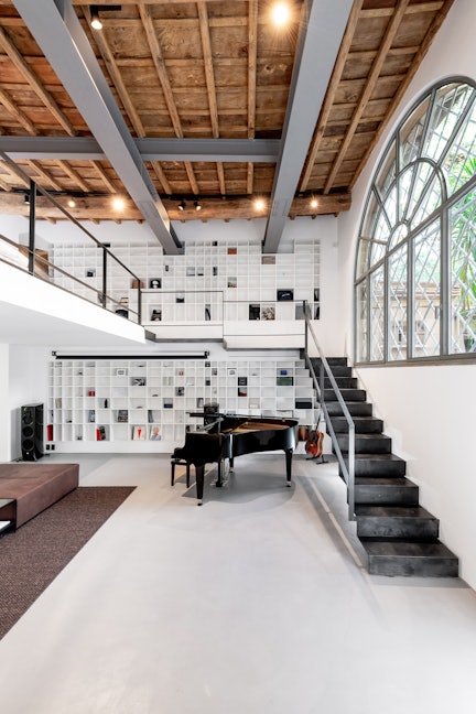
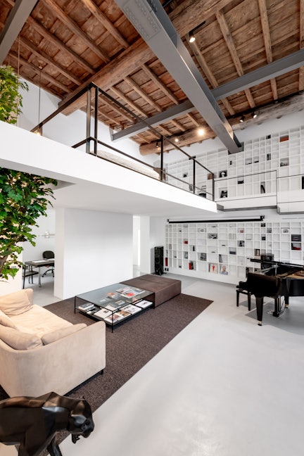
The existing building had quite an original structure, with an interior height of around 6 metres, because it had been used as an artist’s studio. That’s something fairly typical of this street.
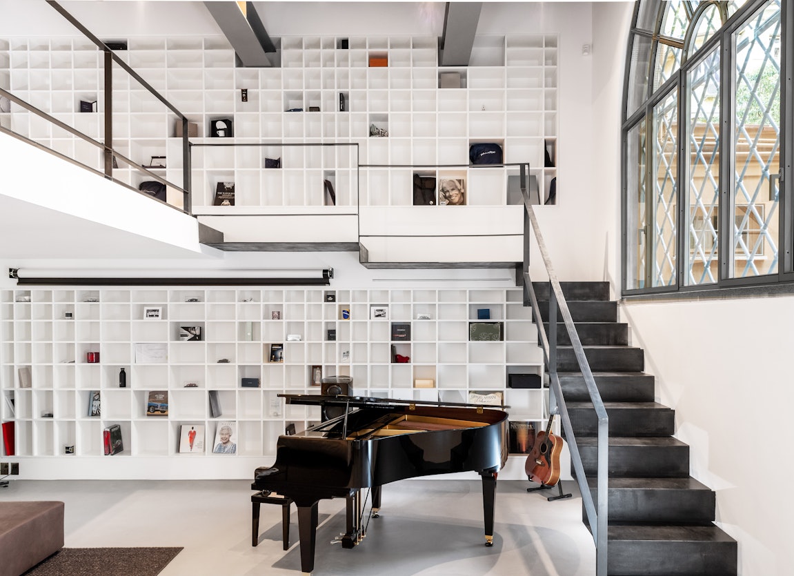
We put a lot of thought into reconfiguring the interiors. We eliminated the old wooden staircase and introduced a new stairway-cum-catwalk in natural iron which reclaimed the two floors while lending a sense of lightness by eliminating any supporting structures. The concept is self-supporting and uses its shape to create resistance, with anchoring points in the wall which we managed by extending some of the risers so that they slotted into the invisible joints in the masonry. This makes the staircase seem as though it is floating and completely detached from the side wall, which houses a double-height bookcase designed in homage to Shirō Kuramata’s perfect proportions. Here too, there is no visible support structure, with resistance achieved through the use of a riser that divides the “catwalk”.
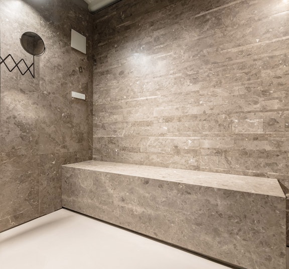
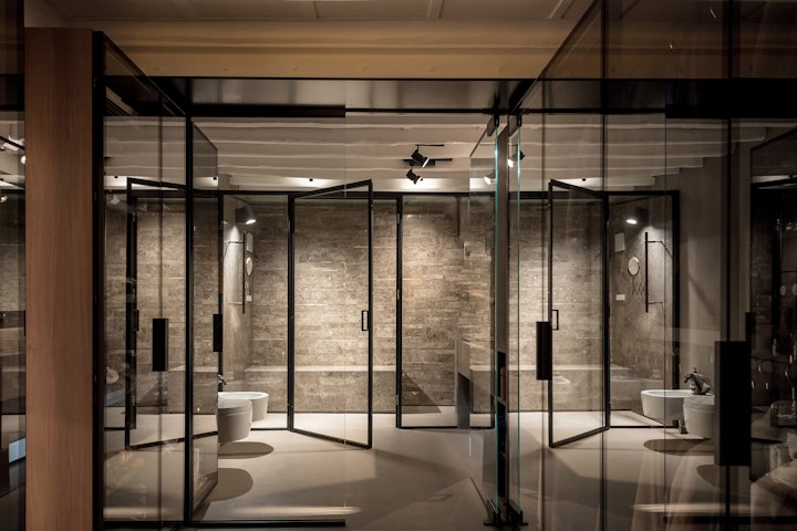
On the top floor there is a private space with a large steam bath that serves as the backdrop to the wardrobe zone.
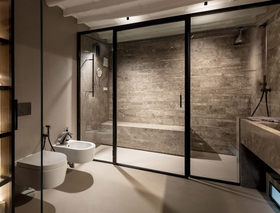
Everything is transparent: illuminated cupboards, the dividers between the bathroom and wardrobe area, and even the partition between the steam bath and the actual bathroom, so the background walls play an important role.
Another practical challenge was the fact that the ceiling had exposed beams and so we had to do some quite specialised measures to isolate it from the steam.
This floor has no windows facing the exterior and so I chose go with an oversize opening, a kind of view on to the double-height space of the ground floor. And, because of its particular geometry (small surface space compared to its height), we immediately called it the “bell tower”.
This bell tower is an intimate space that contains a reading room and a music room. Music is a recurring theme in my designs, especially whenever I see that a client has a certain level of knowledge and sensitivity that can lead to an unparallelled level of customisation in residential settings.
In this case, the house doesn’t only contain an incredible piano, which the client was very clear about right from our first meeting, but also comes with three ultra-slick Linn sound systems for listening to music!
What particularly appeals about the Salvatori products you chose?
I always use Salvatori products in my projects. In this case, in particular, I tried to guide the client towards the Salvatori look and products even thought their original idea was to use less understated, more elaborately veined stones. Not my style at all!
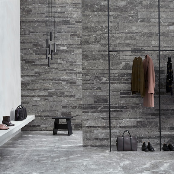
We ended up choosing Gris du Marais® in a mix of honed and Lithoverde® finishes. I’ve always appreciated Salvatori’s commitment to creating sophisticated, special products out of materials that aren’t necessarily particularly rare. It’s something I’ve always liked, along with their three-dimensional wall textures, as opposed to the opulence of polished stone with lavish veining.
Why did you choose Salvatori?
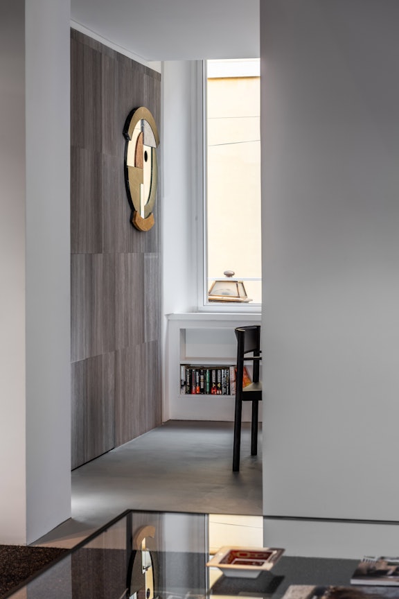
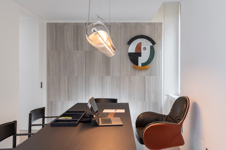
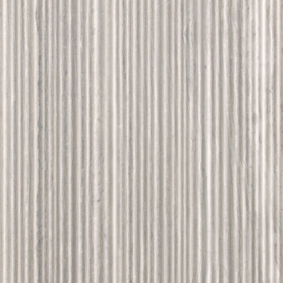
I wanted to create a look that was all about timeless elegance, using non-standard solutions. For example, the Stiletto washbasin in Gris du Marais® is almost 2 metres long, then a part of it goes through the wall into the steam bath and becomes a handy seat in the wet room. To achieve this meant a lot of special production work and attention to detail, just as the dividing wall of the ground floor, which hides the guest bathroom, required extremely delicate workmanship. We didn’t want a door or obvious opening. What we did was to create a pivot door which we clad in Silk Georgette® Spaghetti. This graphic effect of the wall with vertical stripes is one of the most beautiful elements in the house.
How did you find the experience of working with Salvatori?
I would say that this can be understood in what I said above. Incredible commitment to coming up with non-standard solutions to make my design come to fruition, some of which where “unintentionally” complicated. But, when you see the finished result, you’d never know that they were complicated! And I’m really happy about that.
And, is the client happy with the end result?
Definitely!
Now, a final question that is a little off-topic, but at Salvatori, we believe that there’s a special link between music and design. Are you happy to share your 10 favourite songs that you listen to when you’re designing or looking for inspiration?
As I mentioned, I also have a strong association with music. It’s always been a part of my design process, but is also an important element in my private life. I have a broad range of types of music but there are some particular favourites, so in no particular order, here we are:
- Anything, absolutely anything by Joni Mitchell, but if I had to choose, let’s say “A Case of you”
- Lucio Battisti (as above) and in particular “Vento nel vento”
- Afterhours “Padania”
- Vasco Rossi “Gli angeli”
- Sigur Ros “Hoppìpolla”
- Radiohead “Creep”
- Placebo “Too many friends”
- Paul Weller “You do something to me”
- Mia Martini “E non finisce mica il cielo”
- Lucio Dalla “Tu parlavi una lingua meravigliosa"
Architecture by Enzo Di Claudio (studio MarguttArchitetture)
Photography by studio Carbonelli-Seganti
